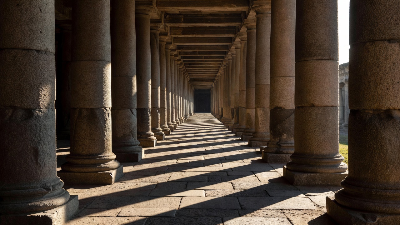
01 — Find the axis, then test it
Symmetry begins with a comparison. Imagine a line dividing a scene: do the two sides reflect one another, or do they merely carry similar visual weight? A symmetrical building may sit in an asymmetrical setting. A doorway can be centred while a tree, a sign or a parked bicycle pulls the photograph elsewhere. Notice those differences before deciding that the camera must be exactly in the middle.
To make a precise frontal study, use a reliable reference such as the centre of a doorway or the meeting line of paving slabs. Hold the camera level and examine both edges of the frame. A small sideways movement often corrects an imbalance more effectively than a later crop. Do not step backwards into traffic while checking the screen. Find a safe position first, then refine the composition within it.
The reflecting pool and framed view at the Taj Mahal in Agra are familiar examples of a strong visual axis. The central water channel at the Salk Institute in La Jolla offers another. Neither example means that a centred image is always the most revealing one. An off-axis view may explain a wall’s thickness, a change in level or the way a route meets its surroundings.
02 — Let repetition establish an expectation
A repeated window is a unit. Several windows establish a rhythm. Once the viewer understands that rhythm, a small variation becomes noticeable: an open shutter, a different reflection or a repair in the masonry. You can build a photograph around that exception without exaggerating it. Include enough repetition to establish the rule, but not so much that the exception becomes impossible to find.
Stair edges are especially useful because each step offers a clear line and a small shadow. A diagonal crop can emphasise movement, while a frontal view can make the same stair feel calm and measured. Keep public circulation clear, and never stand on a handrail or lean across a barrier to remove an unwanted edge. The safer viewpoint often gives more contextual information anyway.
At La Muralla Roja in Calpe, designed by Ricardo Bofill, stairs and interlocking forms have become widely photographed subjects. It is also a residential setting with access restrictions. Study published views for their spatial relationships, but do not mistake visual familiarity for an invitation to enter. A local public stair can teach the same compositional principle without intruding on residents.
03 — Separate convergence from distortion
Parallel vertical lines appear to converge when a camera points upward. That is an effect of perspective, not necessarily a defective lens. Lens distortion is a different issue: it can make straight lines bow or bend, especially near image edges. Understanding the distinction helps you choose an intentional treatment rather than trying to correct every unusual line in the same way.
For a quieter architectural study, keep the camera’s sensor plane approximately parallel to the wall. You may need to include more foreground, use a more distant viewpoint or accept that the top of the building sits outside the frame. For an expressive upward view, let the convergence be clear and decisive. A slight accidental tilt often feels less convincing than either a level study or an intentionally steep one.
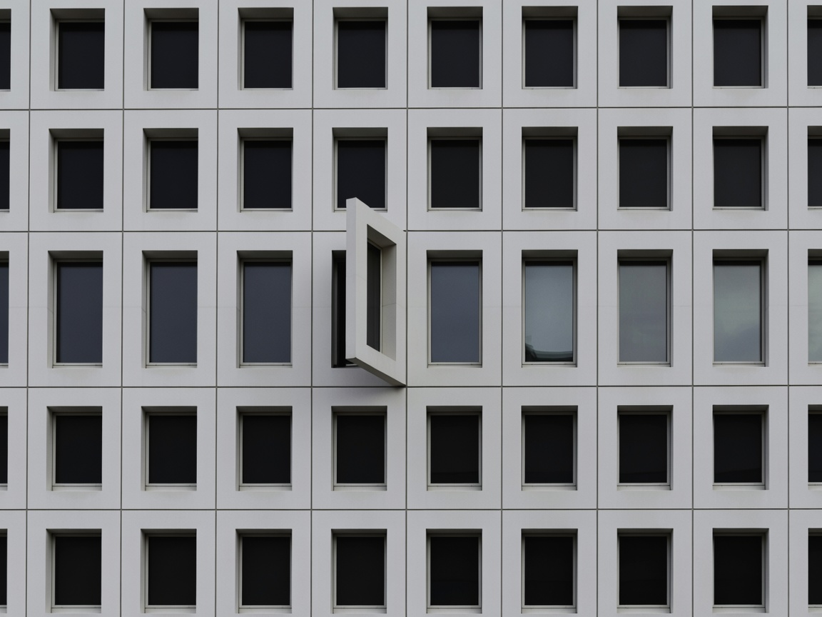
04 — Make three positions do the work
Choose a colonnade, a fence or a row of windows visible from a public walkway. Make the first photograph straight on. Move diagonally and make a second frame in which the repeated units overlap. For the third, isolate a single interruption. Keep the focal length unchanged if possible. This makes it easier to see how position, rather than equipment, alters the relationships.
On review, ask where your eye enters and where it stops. Does a line lead to the subject, or out through a distracting corner? Does the frame contain an awkward half-unit at its edge? Cropping can help, but leave enough breathing room to preserve the original spatial idea. Avoid treating compositional rules as tests that every photograph must pass.
For further looking, compare the repeated arches of Rome’s Palazzo della Civiltà Italiana with the layered ramps of Frank Lloyd Wright’s Guggenheim Museum in New York. One invites a reading of stacked units; the other encourages a continuous spiral. Your task is not to force both into the same formula. It is to find the organising relationship each scene offers.