01 — Keep the outline in perspective
“Modern” can describe a historical architectural movement, or it can simply mean a building that looks recent. Those meanings are not identical. A glass tower may repeat an established idea, while an older concrete building may still feel unfamiliar. Use a building’s name, architect and documented context when available, rather than assuming its age or purpose from its appearance.
Begin with a distant view that shows the main volumes and the route toward them. Does the building rise from a continuous base, separate into several parts or curve around an open space? Make a simple verbal description before taking a photograph. “Three projecting volumes above a recessed entrance” is more useful in the field than a vague label such as “futuristic.”
The Sydney Opera House, designed by Jørn Utzon, invites attention through its roof forms. The Heydar Aliyev Center in Baku, designed by Zaha Hadid Architects, presents a different relationship between building envelope and surrounding ground. From a photograph, both can appear continuous and sculptural. Close inspection reveals joints, changes in direction and practical boundaries that the distant view suppresses.
02 — Find the unit inside the curve
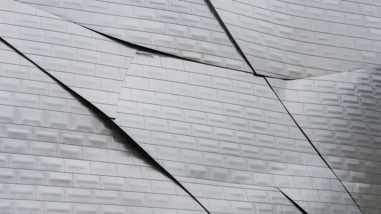
At the Guggenheim Museum Bilbao, designed by Frank Gehry, titanium cladding breaks large curved forms into small visible units. A close photograph can show the scale of those panels, the irregular light across them and the way adjacent surfaces turn away from the viewer. It cannot, by itself, tell you the full structural system behind the cladding.
This distinction matters. A building’s outer skin is not always its main load-bearing structure. A visible diagonal might be a structural member, a shading element or a decorative screen. Describe the visible shape first. If the construction role matters to your caption, verify it through reliable project documentation rather than inferring it from visual confidence.
The Centre Pompidou in Paris, designed by Renzo Piano and Richard Rogers, offers a productive contrast. External circulation and services contribute strongly to its public image. In a close frame, however, a pipe, a bracket or an escalator enclosure can become an isolated pattern. Include a contextual photograph so that your attractive abstraction does not erase the relationship you intended to explain.
03 — Inspect where the idea meets the pavement
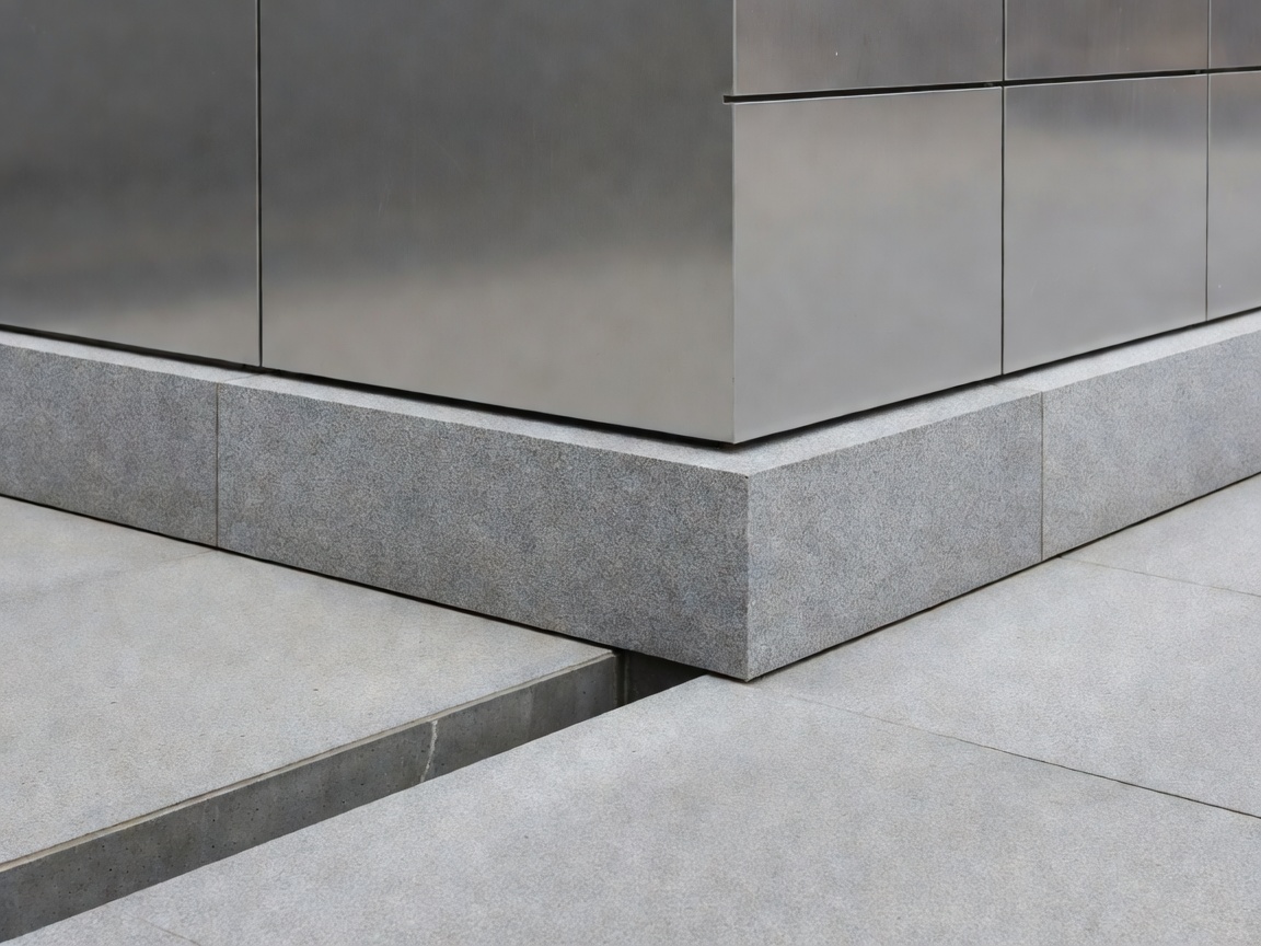
The base of a building is where an ambitious form meets everyday use. Look for entrance thresholds, drainage channels, handrails, ventilation grilles and changes in paving. These details may be visually quiet, but they explain how people approach the architecture. A dramatic overhang means something different when the photograph also shows the waiting area or the sheltered route beneath it.
At Oslo Opera House, designed by Snøhetta, the accessible sloping roof makes the relationship between architecture and public movement especially visible. Access remains subject to local conditions and management. Sloping surfaces, wet stone and changing weather are practical concerns, not compositional inconveniences to ignore. A useful architectural image should not require you or anyone else to take an avoidable risk.
04 — Compare decisions, not reputations
You do not need to travel between famous buildings to make a meaningful comparison. Choose a recent library, a station entrance or a local office façade. Compare its entrance with that of a nearby older building. Is the door obvious from the pavement? Does a canopy mark the route? Does the material change at the point where hands or feet are likely to touch it?
Then make a pair of photographs at a similar scale. One might show a deep stone threshold; the other, a nearly flush metal-and-glass entrance. Keep your captions descriptive. Neither solution is automatically more welcoming or more accessible merely because of its appearance. Those judgments require more information about dimensions, operation and actual use.
For a wider reference, look at Toyo Ito’s Sendai Mediatheque and the Louvre Abu Dhabi by Jean Nouvel. Their very different spatial ideas encourage questions about supports, light and the relationship between enclosure and openness. Use those questions on your own street. The reward is not collecting famous façades; it is becoming more precise about what a building asks your eye to do.